
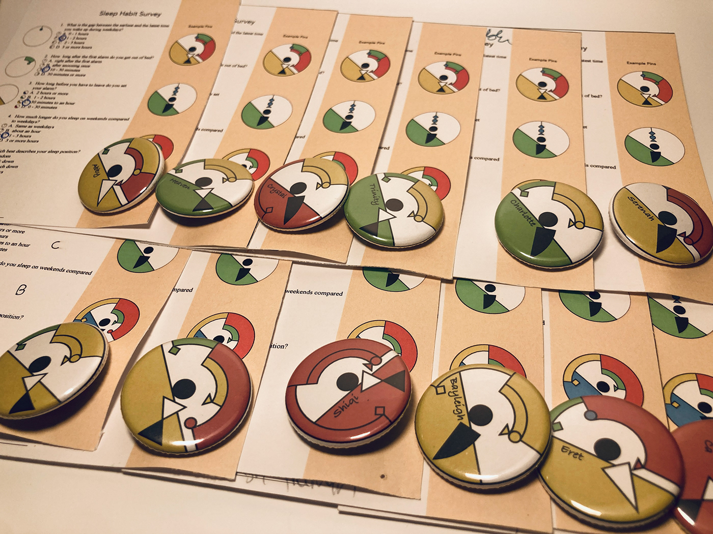
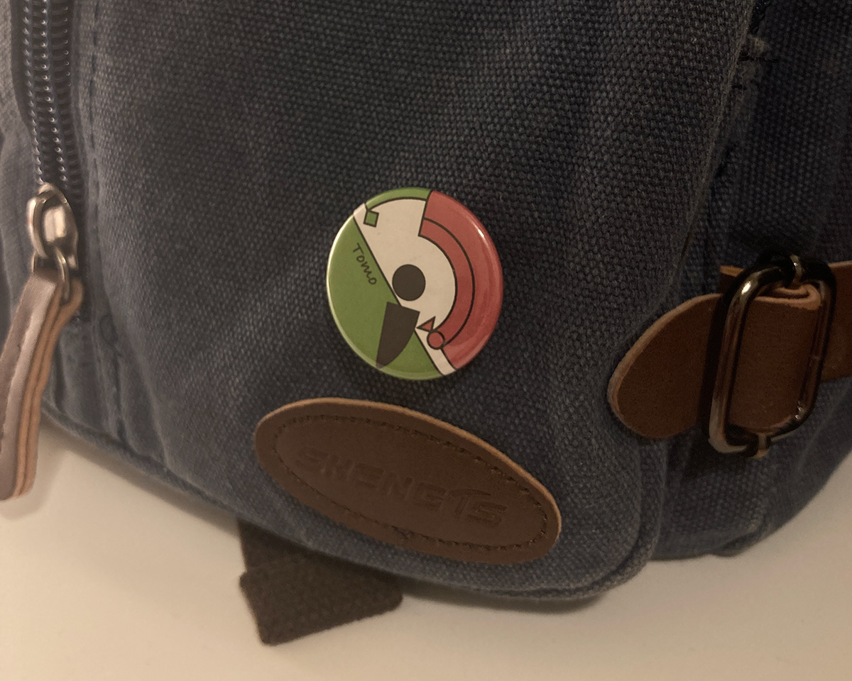
This project is based on the Data Portrait project by Italian graphic designer Giorgia Lupi. I created a survey about people’s sleep habits with multiple-choice questions. I then created a design system in which each of the elements of the design is based on the respondents' answers to the survey. I did my survey in my Greek and Roman Art History class, and after designing all the pins based on the answers, I made them into actual pins and gave them back to the participants with the survey sheets that they filled out.

My survey contained 5 questions that correspond to 5 elements on my pin and they were,
・What is the gap between the earliest and the latest time you wake up during weekdays?
・How long after the first alarm do you get out of bed?
・How long before you have to leave do you set your alarm?
・How much longer do you sleep on weekends compared to weekdays?
・Which best describes your sleep position?

My idea of the design was to resemble a clock-like shape because most of my survey questions were about the length of time relating to one's sleep habits. I also had an idea to visually represent the answer for the sleep position.
For the colors, I chose 4 colors as the questions each had 4 options for the answers. My choice of color was the very basic 4 colors that one would possibly think of first. I did a quick research to back up my idea of blue being a safe and calm color, and the closer to red it gets, it becomes more warning and disturbing. I incorporated this idea with each of the questions. For example, for question 1, the shorter the time you answered is, the more stable and consistent your sleep habit is, so I would use blue for the answer with the shortest time, and transition to green, yellow, and red as the answered time gets longer. The same idea was used for all the other questions except for question 5 because that was about sleep positions, which I believe has no relation to how stable your sleep habit is.
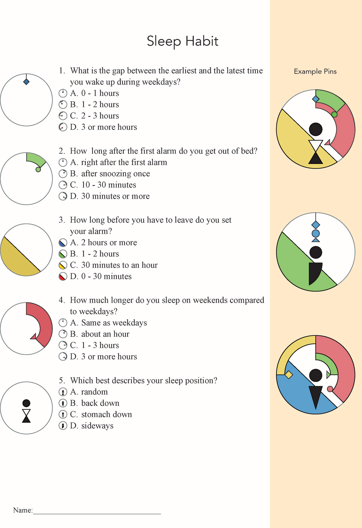
The survey had to contain all the questions, example elements that the question corresponds with, and example pin designs. The layout was very important as all of these had to fit on a 4.25in × 5.5in sheet of paper.
I handed out the survey at the beginning of class and collected them at the end. The process of making the actual pins was quite interesting. It was all done by hand using a tool to make pins.

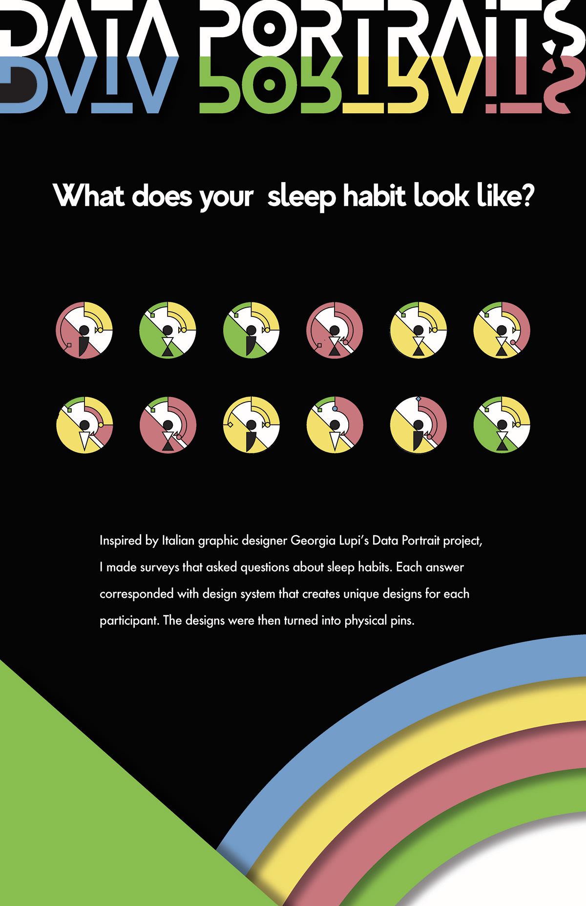
The last step of the project was to make a poster that briefly explains the project. I looked for impactful posters on the internet and did some research about their layouts. My first goal was to find an interesting typeface that draws people's attention. I found a typeface called MADE Evolve Sans which was quite unique and was also matching my design system. After a few sketches of the layout, I hopped onto Adobe Illustrator to create the poster. I tried incorporating my pin design into the poster. The bottom right part with the drop shadow effect was inspired by one of my classmates My's poster in the Work In Progress critique that had a paper cutout design using the drop shadow effect.

This was actually my first time designing something based on the data that I have. It has some similarities and differences with just purely designing something artistic, but the biggest challenge is that I have to have a clear reason for how I want to represent something in my design. I learned a lot about how to collect data, and how to incorporate those datasets in my design through this project. Additionally, having to reason my design choices has made me better at defending my own design with a reason.


